
Friday, 25 April 2014


Thursday, 24 April 2014


Wednesday, 23 April 2014
Evaluation 6
What have you learnt about technologies from the process of constructing your product?
This is my podcast to answer evaluation 6
Evaluation 5
How did you attract/address your audience?
Here I have evaluated and annotated each of my 3 pieces of work in order to answer this question.
Tuesday, 22 April 2014


Sunday, 20 April 2014
Friday, 18 April 2014
Evaluation 2
How
does your media product represent a particular social group?


I believe that my magazine represents similar social groups to
those of magazines such as “Kerrang!” and “Rock Sound”. The image on the left
was taken from a shoot done by “Kerrang!” magazine and the one on the right is
one of my original images that I have used on the front cover of my magazine. Teenagers
who listen to rock music are stereotyped as ‘moody’ and both of these images
show ‘moody’ teenage girls and are relatable to the target audience also
because of age. The style of the model in my picture is simple and the dip-dyed
hair is a popular style for teenagers and young adults. This reflects the style
of my target audience and so the magazine represents their social group. The
messiness of the girl’s hair in both pictures represents the stereotypical teenage
rocker attitude and rebellious style.
Both of these images are similar in terms of camera angle and shot
and are both taken at eye level and are slightly longer than mid-shots. This is
an appropriate shot to take for the cover as there is space all around the main
part of the model for titles, pictures and cover lines. Also the models facial expression
can be seen but so can her slouchy posture representing her attitude. The pose
of the model is very important and poses are different depending on the genre
of the magazine. Magazines such as “Teen Now” would have would have very happy,
cheery covers as the social group it is aimed at is different and younger. However,
rock magazines such as “Kerrang!” use different and unusual posing to match the
style of the target audience.
Even though the magazines “Kerrang!” and “Q” are for similar
audiences in terms of genre, they are for different social groups. This can be
seen by even the quality of the paper it is printed on, “Q” is printed on
shiny, thicker paper compared to “Kerrang!” which is printed on slightly flimsy
magazine paper. This makes the price of “Q” higher at nearly £4 an issue
compared to “Kerrang!” at an average of £2.50 per issue. This shows that the
two magazines are aimed at different social groups as “Q” is aimed at audiences
with slightly more money. My magazine would be similar to “Kerrang!” in terms of
price not only for my particular social group, but also because of the age of
my target audience.
Wednesday, 16 April 2014
Evaluation 1
I have made a slideshare presentation to answer the question of Evaluation 1 -
In what ways does your media product use, develop or challenge forms and conventions of real media products?
Monday, 14 April 2014
Questions
1. In what ways does your media product use, develop or challenge forms and conventions of real media products?
2. How does your media product represent particular social groups?
3. What kind of media institution might distribute your media product and why?
4. Who would be the audience for your media product?
5. How did you attract/address your audience?
6. What have you learnt about technologies from the process of constructing this product?
7. Looking back at your preliminary task, what do you feel you have learnt in the progression from it to the full product?
Thursday, 10 April 2014
Change - Double page spread layout
I researched and looked into style models such as Kerrang! and Rocksound and was unable to find a double page spread layout similar to mine. I chose to do this layout because if I had black over the whole background, the picture looked unprofessional and her shorts almost disappeared into the background. I chose to have the background behind all of the text black to make it stand out and most style models have the background of the text a different colour to where the photo is.

I do not believe that this looks authentic as the shape of the black background or this effect, I have never seen used before. Now I have chosen to make just over half of the page black, and make the text fit within it. The title overlaps onto the white section of the page so I have added a 'broken' black background to this section to make it still stand out. I have also added white borders to the pictures to ensure that they stand out and this also looks more like style models I have seen. I will also be filling the space to the right with the rest of the interview.

Monday, 7 April 2014
Font size
I printed out my contents page at the size of a real magazine and compared it to my style models such as 'Kerrang!'. I realised that the font used for the main part of my contents page was too big compared to style models. I have now made it smaller and I will again print it to check the size before it is completed
Picture change
On my contents page I have decided to change one of the smaller pictures under the main featured one. This is because all 3 pictures were of girls modelling. The use of no musical instruments may have made readers confused as it was not clear that it was a music magazine just from these pictures. To make it more obvious, I have decided to use a picture I have taken of one of my friends whilst he was on stage at a gig. This picture includes a microphone and a guitar and is also darker which immediately gives it a 'rock magazine' look.

Thursday, 3 April 2014
Added feature
I have added a feature onto the front cover of my magazine. I have seen this used on multiple covers of magazines such as 'Kerrang!'. I thought it would be a good addition to my to attract attention using an original image that I took during my photoshoot.
Kerrang Kerrang Mine


Kerrang Kerrang Mine
Monday, 24 March 2014
Cover line change
I have chosen to change the colours of the boxes and text of my main cover line "Megan Hulse". I looked at a number of style models and found this one...

I believe that this goes well with my colour scheme and with the right text to suit my magazine, it would look good on my magazine. My previous cover line did not look professional and the text looked out of place.
Previous New

Page Number change
I have decided to change the number of the page on my double page spread. This is because the number used to be 17 - an odd number. After researching multiple magazines I have found that the left page of a double page spread is almost always an even number because of the way that magazines are made. To make mine even just a little bit more professional and authentic, I have made mine an even number also.


These are examples of double page spreads from 'Kerrang!'. This magazine is my main style model so conventions used by this magazine are great for me to use also.


These are examples of double page spreads from 'Kerrang!'. This magazine is my main style model so conventions used by this magazine are great for me to use also.
Monday, 17 March 2014


Sunday, 16 March 2014
Contents Page update
I have made some changes to my contents page, it is still not my final draft. However, I have used some of my audience feedback suggestions to improve my contents page.


Thursday, 13 March 2014
Audience Feedback Part 2
It will be easier to see the good points about my magazine and also improvements I could make if I separate my audience feedback into each of my 3 pieces and into bullet points.
Front Cover
- I really like your front cover, this image really stands out and I also like the masthead and how it builds up the L!
- The picture on the front page shows the audience that this is clearly a rock magazine aimed at teenagers. I love the little rectangles next to the title that look like the volume button!
- The direct mode of address is effective at drawing the reader's attention.
- The house style clearly connotes the Rock genre, as does the model's clothes and make up.
- The masthead being behind the image shows that the brand is already popular and established.
- Your image on the front cover is incredible pose wise and will really attract your target audience to view your magazine! Smart yet fitting for the music.
- The cover could be improved my adding more cover lines to the blank space on the left.
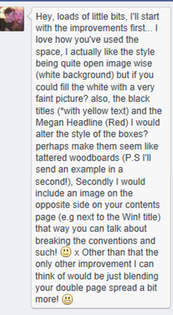
- Fill the white space with a very faint picture.
- Change the style of all of the boxes to look like tattered wood boards.
Contents Page
- The contents page looks very professional and looks really good how your text is all on one side and the images on the other side that works really well!
- This contents page clearly shows you have consulted a style model as it uses the conventions of a music magazine's contents page.
- I like that you have used 3 different models because it shows variety and that you have organised your photo shoots well. Each model is using direct gaze capturing the attention of the reader.
- I think the contents page could be improved by adding another page number that shows the page number of the Megan Hulse article on the front cover as this is the focus of your double page spread and the main article in your magazine.
- The "Subscribe to L!" section breaks the house style but is actually effective because it causes the reader to be drawn to it.
- Your contents page is exceedingly well set out and I think you can use the black on yellow text in some other places as well!
- Include an image on the opposite side on your contents page
Double Page Spread
- Your double page spread is amazing, the text is all in line with each other.
- Try adding some page numbers at the bottom.
- The double page spread is laid out well and the different coloured writing really makes the major parts stand out.
- The double page spread looks quality!
- I love the double page spread the way the background behind the text highlights Megan.
- I like the way you have the red line at the top running through the double page spread keeping your colour scheme throughout.
- The house style is consistent with the rest of the magazine creating a uniform look.
- The picture relates to the "Wild Child" content of the article, and the image's mode of address again draws the reader's attention.
- Your double page spread images are once again outstanding! Really show her off as the 'main' feature! Over all amazing!
- Blend your double page spread a bit more.
General
- The colours run well throughout the whole magazine.
- I really like your colour scheme, dark but vibrant. Really looks good.
- I also like the text too, nice font.
- Looks really professional, the white, red, black and yellow colour scheme really bounce off each other and go well and you've kept within your house style.
- I really like all of your pages they all look very professional!
- The only thing I can say is fill in some white space which i'm sure you were going to do anyway!
- I love your logo.
Monday, 10 March 2014
Audience feedback
I put my Front cover, Contents page and Double page spread onto Facebook. This is the most popular social networking site so I thought that this would be the one on which I would get the most responses. Also, most of the comments are from friends aged 16-20 which is my target audience which gives me good feedback from my target audience.
This post is my evidence of audience feedback from all 3 of my pieces of work. Later, I will split them into comments about each piece.


Monday, 3 March 2014
Background change
I have decided that my background for my front cover was not right. After editing it a number of times, the darkness of the background still makes the image in front look unprofessional. By changing the background to plain white, the image now looks clearer. I have placed a black bar under the magazine title and now it stands out more. I think that the cover looks all together 'cleaner' and more professional. My cover is still not complete as there is too much space and it needs more information. However, I know have my main aspects of the cover sorted; background, picture, masthead and main cover line.


Wednesday, 12 February 2014
DRAFTS
I have completed drafts of my front cover, contents page and double page spread of my magazine.
I will now be able to focus on the smaller details and text when I return after half term.
Front cover


Double Page Spread

I will now be able to focus on the smaller details and text when I return after half term.
Front cover
Contents
Subscribe to:
Comments (Atom)